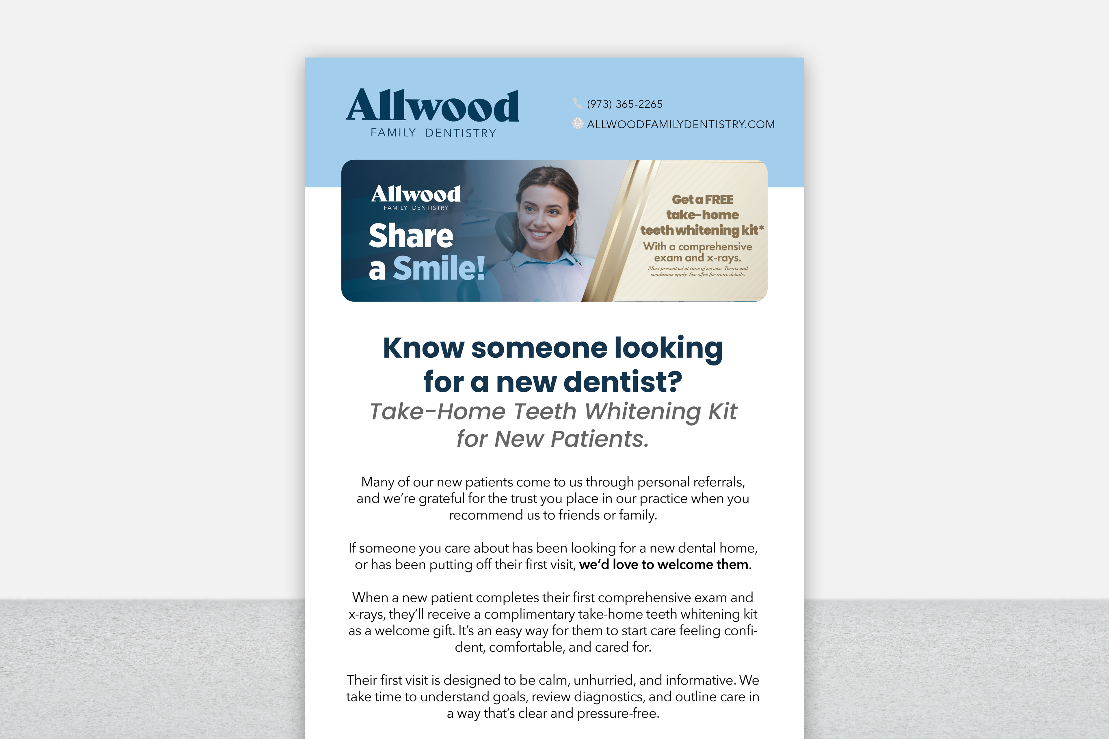
Allwood Family Dentistry
For this email campaign, I focused on translating Allwood Family Dentistry’s patient‑growth message into a warm, approachable digital format that feels personal and easy to engage with. The design emphasizes trust and community connection through friendly typography, balanced spacing, and consistent brand elements that carry seamlessly across devices. I structured the layout to make the new‑patient whitening offer immediately clear while keeping the overall tone inviting and supportive. The visual hierarchy guides readers naturally from the headline to the call‑to‑action, creating an email that feels both welcoming and effective in encouraging referrals.
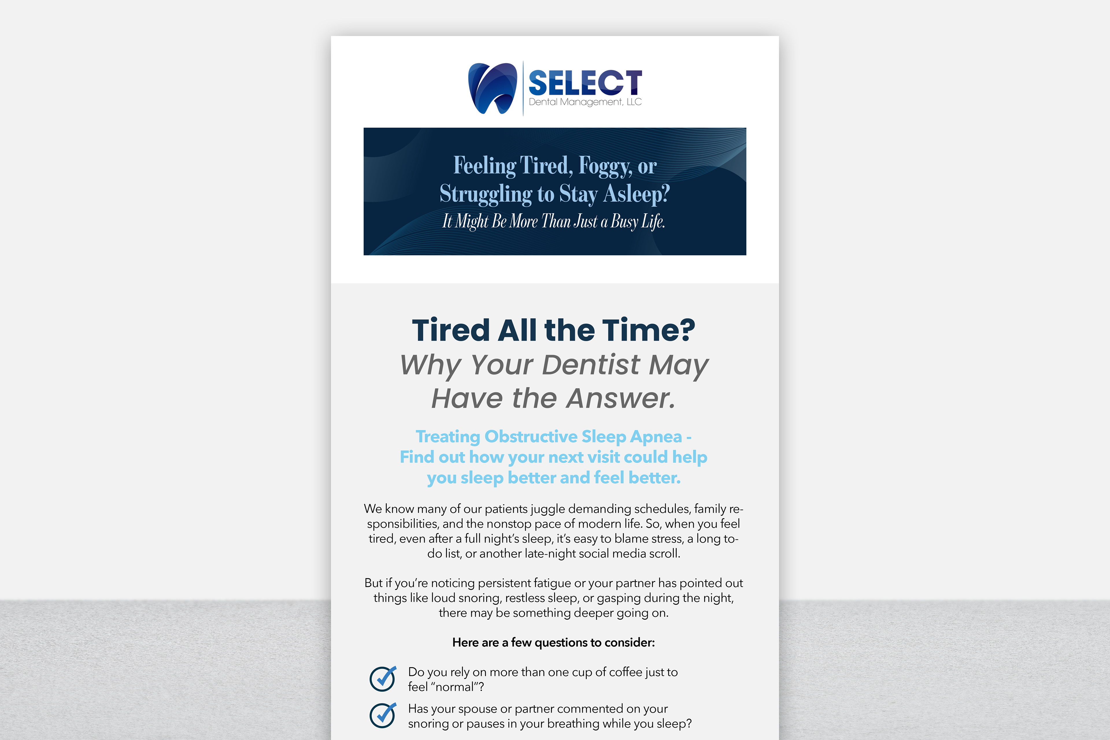
Select Dental Management
For this email campaign, I created a digital design that feels calm, approachable, and easy to scan. I focused on establishing a clean visual hierarchy that guides the reader from the headline to the key symptoms and call‑to‑action without overwhelming them. Soft colors, clear typography, and intentional spacing help translate a complex health topic into a visually intuitive email that encourages patients to recognize symptoms and take the next step in their care.